Operations teams managing the post-trade allocations lifecycle had no historical data. When allocations were delayed, there was no way to see patterns: which clients caused them, how often, or why. The brief was to speed up the allocation process. I built the scope from scratch.
Overview
No scope, no problem statement, no existing design.
Fidessa's middle office operations teams — approximately 300,000 professionals across 600+ global financial firms — manage the post-trade settlement lifecycle. I was asked to speed up the allocation process ahead of European T+1 regulatory requirements. There was no defined scope, no clear problem statement, and no existing design to build from.
I led the project end-to-end as the sole designer: from domain research and problem definition through discovery workshops, design, and one round of validation with operations staff.
Project Timeline
Domain research — knowledge transfer sessions with PMs, allocations workflow mapping
User research — 12 interviews with middle office traders in Europe and Americas
Design — dashboard, firm and client level analytics, time-based trend, export
Validation — one round with 12 participants across Europe and Americas
The Problem
No brief. No data. No way to be proactive.
Stated ask
Speed up the allocation process.
Actual problem
Operations teams had no historical or analytical view of their allocations. When delays occurred, there was no data to help staff identify patterns. Which clients were causing delays, how often, or why. Without that visibility, teams couldn't be proactive: they couldn't address root causes, and they couldn't tell clients to correct how they were sending information. Everything was reactive.
Why it matters: a regulatory change is driving urgency. European firms are moving to T+1 allocation completion, a requirement the Americas already meet. Teams that cannot identify and address sources of delays before that transition will be directly exposed to compliance risk.
Understanding the Domain
The allocations workflow is more complex than it looks.
Before making any design decisions, I needed to understand how the allocations workflow actually worked: the data, the services, the tools, and where breakdowns occurred.
I conducted knowledge transfer sessions with PMs to build domain fluency, then led cross-functional discovery workshops to map the end-to-end workflow. Output: workflow maps and information maps covering all services and functionalities users currently interact with.
What surfaced: allocation delays consistently trace back to one of three root cause types — client data, order data, or service errors. Operations teams had no way to surface which type was responsible in a given case, let alone see patterns over time. The entire workflow was reactive and queue-based, with no historical layer at all.
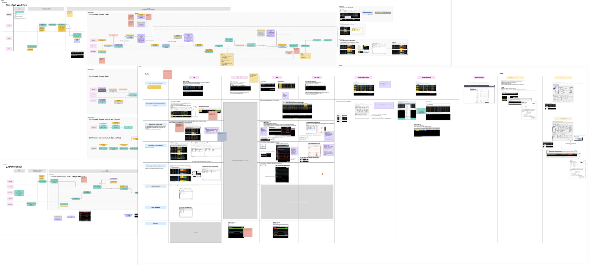
End-to-end allocations workflow map produced during knowledge transfer sessions with PMs.
Defining the Scope
Three problem areas. One design vehicle.
The original ask gave nothing to constrain against. Through discovery and user research, three distinct problem areas emerged.
Dashboard
Fragmented views of the same workflow displayed across separate grids with no consolidated analytical layer
Summary analytics
No data on which clients, fields, or services generate the most delays or require the most manual intervention
Export and print
Operations teams hold regular client reviews and need a way to bring analytics data into those conversations
Middle office operations staff are expert users with deeply ingrained workflows. Any changes to how they currently work would create significant disruption. The dashboard approach added a new analytical layer without forcing changes to existing workflows, surfacing the information they needed without asking them to work differently.
Design Process
Tables, not charts. Default state, not configuration.
The core design challenge was visualization: how do you represent the health of thousands of client accounts and allocation batches in a way that lets an operations professional immediately see where to focus?
Operations staff are highly comfortable with data tables. The goal was not to replace tables with charts, but to design tables where the default state surfaces a clear next step. Opening the dashboard, a user should immediately see which clients are creating the most noise and know what to raise in a client conversation, without configuring anything first.
Decision 1
Preset grids structured around the three root cause categories
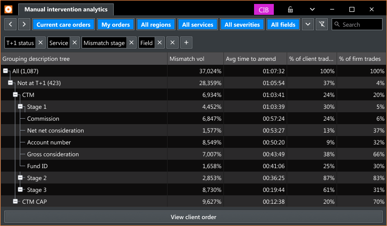
Root causes always fall into one of three types: client data, order data, or service errors. Preset grids for each category let users arrive at the relevant data without any setup. Firm level and client level views serve two distinct operational contexts: one for internal prioritization, one for client conversations.
Decision 2
Surfacing data at the client and field level over time
To enable proactive management, the dashboard presents aggregate data historically. Time filters (6 months to 3 years) let teams see trends: which clients are repeatedly causing delays, which fields are consistently amended, and whether the overall situation is improving or worsening.
Decision 3
Export and print as a first-class feature
Research surfaced export and print unprompted across multiple sessions. Teams hold regular client reviews. Designing for export from the start ensures the analytics are useful beyond the platform, in the conversations where accountability decisions are made.
Delivered design
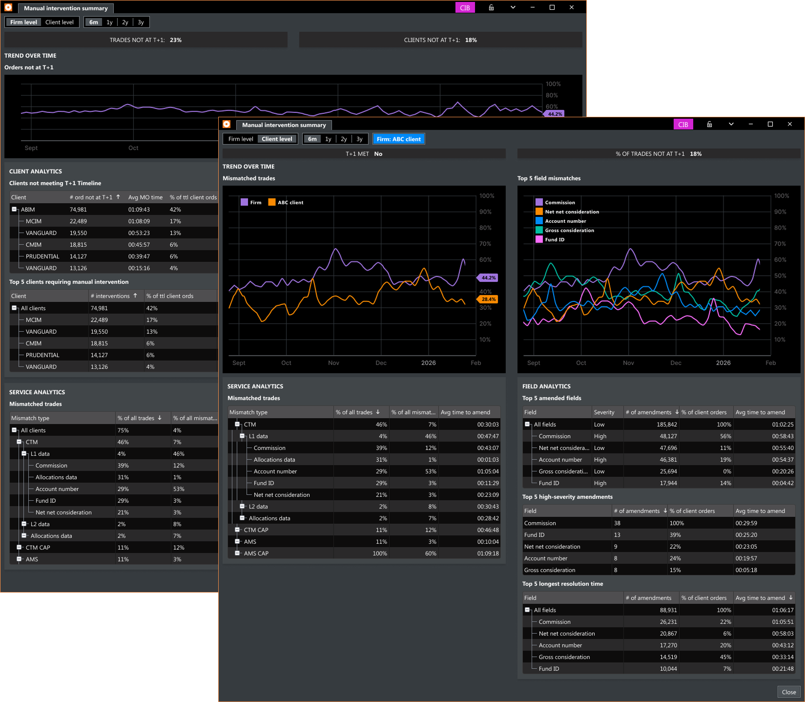
Manual intervention summary — firm level and client level views showing T+1 trend, client analytics, field analytics, and service analytics.
Validation
One round. Concept confirmed.
One round of user validation with 12 participants, a mix of returning research contributors and new participants. Reception was positive across the board. Users immediately understood the value of historical analytics: a capability that had never existed for them on the platform before.
"This is great! We've been waiting for a way to get historical analytical data about our allocations."
Middle Office Trader
"I would definitely use this to find out what to talk to clients about."
Middle Office Trader
Outcome
Shipped. KPI exceeded.
Middle Office Dashboard — firm level and client level views, field mismatch analytics, client response analytics, service mismatch analytics, time-based trend, export and print
ShippedKPI target was a 15% reduction in allocations not meeting T+1. Post-launch result: 23% reduction. The result is notable given that Fidessa has no built-in mechanism for notifying users about new features, so adoption builds gradually after release.
Reflection
Domain first. Design second.
This project required significant domain learning before any design work could start. The allocations workflow, the relationships between services, and how delays are attributed at the client and field level were not things I could assume going in. They had to be learned from the ground up through knowledge transfer and workshop facilitation.
What I'd do differently: engage users earlier. Setting up interviews took longer than it should have. Earlier outreach would have compressed the discovery phase and brought real user perspectives into scope decisions sooner.